

The onboarding practices that move the needle most are painfully specific: get users to a real first win in under five minutes, delay signup until they have felt that value, guide them contextually instead of front-loading a tutorial, and layer in progress mechanics that keep them coming back. Products that get this right see activation rates in the 40 to 60 percent range and churn drop by 20 to 50 percent, because activation and retention move together. The rest of this guide breaks down how to build that flow, measure it, and fix it when it stalls.
TL;DR:
- Delaying signup until users experience a clear first win significantly boosts conversion rates and reduces Day 1 abandonment by up to 50 percent.
- Contextual, interactive guidance replaces static tutorials and can cut time-to-value by approximately 40 percent, improving user retention.
- A well-structured onboarding flow should focus on three phases: orient within 60 seconds, activate in five minutes, and reinforce over the next week.
- Measuring onboarding success through completion rates, time-to-value, activation, and 7-day retention helps identify friction points and experimental improvements.
- Most onboarding improvements come from removing unnecessary steps, optimizing permission timing, and simplifying personalization to avoid overwhelming users.
Table of Contents
- User Onboarding Best Practices: What Works and Why
- Designing the Flow: Orient, Activate, Reinforce
- Measuring Onboarding: The Metrics That Prove It Worked
- Your First Two Weeks: An Onboarding Iteration Checklist
- Common Onboarding Anti-Patterns to Kill First
- How Requestum Approaches Onboarding Builds
- Segmentation Strategies for Different User Personas
- Onboarding Across Multiple Platforms and Devices
- Using Behavioral Analytics to Optimize the Flow
- Building Feedback Loops Into the Onboarding Experience
- Tools That Support Onboarding Automation
- What Shipped Projects Teach About Onboarding
- Getting Onboarding Built Right the First Time
- Sources
User Onboarding Best Practices: What Works and Why
Most onboarding advice reads like a checklist assembled by committee. What follows is the shorter, sharper version: the handful of practices with real leverage, in the order you should tackle them.
1. Design for time-to-value first, not feature coverage. Time-to-value (TTV) is the clock between signup and the moment a user experiences the product's core benefit. For self-serve SaaS, the target is under five minutes. For consumer apps, it is often closer to 30 to 90 seconds. A project management tool should get a user to a populated board, not a settings screen. A fintech app should show a real balance or transaction, even a sample one, before asking for a bank link. Pick one action that proves your value proposition and strip everything else from the first screen.
2. Defer signup until after the "aha" moment. Making someone create a password before they have seen anything is the single most common onboarding tax teams impose on themselves. Delaying registration until users feel value can lift conversion by 30 to 50 percent and sharply cut Day 1 abandonment. Guest mode, sample workspaces, and "try before you buy" previews all accomplish the same goal: let the product sell itself before asking for a commitment.
3. Replace tutorials with contextual, interactive guidance. Tooltips that appear exactly when a feature becomes relevant, paired with short interactive walkthroughs where the user performs a real action, consistently beat static product tours. Contextual walkthroughs can cut time-to-value by roughly 40 percent compared to passive slideshows, because people retain "do this" far better than "here's what this button does." Save tooltips for secondary features; reserve full walkthroughs for the core workflow.
4. Add progress mechanics that create momentum. Progress bars, step counters, and setup checklists give users a visible reason to keep going. Progress indicators and checklists can raise completion by 20 to 50 percent overflows with no visual feedback. Keep the checklist to three to seven core steps. Anything longer starts to feel like homework, and completion rates fall off a cliff past 20 total steps in a flow.
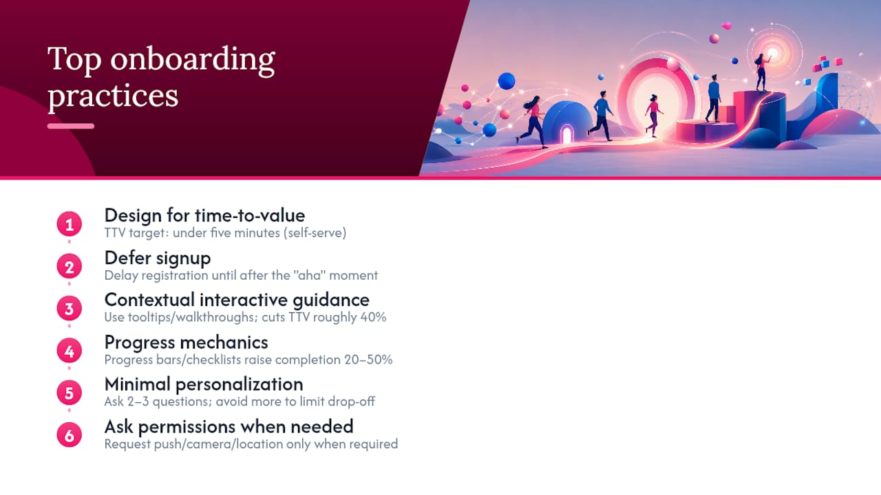
5. Personalize with two or three questions, not ten. Ask what role someone has, what they are trying to accomplish, or which use case fits them best, then route them into a tailored flow. Two to three questions is the ceiling before personalization starts costing you more in drop off than it earns in relevance. Save the rest for progressive profiling, collecting additional detail gradually as the user engages further.
6. Ask for permissions only when the task demands them. Push notifications, camera access, location, and contacts should never appear on launch. Platform guidance from Android's onboarding patterns recommends requesting a permission at the exact moment a feature needs it, paired with a short line explaining why. This "permission priming" raises consent rates and prevents the reflexive "deny everything" response users default to when a wall of system dialogs hits them on day one.
7. Make authentication painless. Passkeys, social single sign-on, and biometric login remove the friction of remembering a new password for yet another tool. Whatever method you choose, build a clear account recovery path. Users who get locked out during onboarding rarely come back to try again.
8. Treat empty states as onboarding moments, not dead ends. A blank dashboard reads as broken. Populate first-run screens with sample data and a single clear call to action instead. A CRM might load a demo contact. An analytics tool might show a sample chart with real interactivity. This is especially important for content-heavy apps, where an empty feed or library kills momentum before the user has created anything of their own.
9. Let users save progress and resume later. Onboarding rarely happens in one sitting, especially on mobile or in B2B tools where a decision-maker gets interrupted mid-setup. Cache state at every step and let people pick up where they left off, rather than restarting from screen one.
10. Write microcopy that assumes good faith. Error messages during onboarding should explain what went wrong and offer a next step, not just flag failure. "That email is already registered, want to log in instead?" recovers a user. "Invalid input" loses one. Encouraging, specific language throughout the flow reduces the sense that onboarding is a test the user might fail.
Pro Tip: Audit your onboarding copy the way you would audit a support ticket queue. If a line only makes sense to someone who already understands your product, a first-time user will stall right there.
Real examples help make these abstract points concrete. A swipe file of more than 20 SaaS onboarding flows shows the same patterns recurring: sample data visible on first load, one dominant call to action per screen, and role-based branching that happens within the first sixty seconds.
Designing the Flow: Orient, Activate, Reinforce
A useful mental model breaks onboarding into three phases, each with its own timing and job to do. SaaS onboarding research frames this as Orient, Activate, and Reinforce, and it maps cleanly onto how real products should sequence their flow.
- Orient (0 to 60 seconds): Confirm who the user is and what they came to do. This is where your two or three segmentation questions live, along with any absolutely necessary upfront setup. Nothing else belongs here.
- Activate (1 to 5 minutes): Get the user to their first meaningful action. This is the contextual walkthrough, the sample data, the guided first task. Permission requests that support this specific action can appear here, framed with a reason.
- Reinforce (5 minutes to 7 days): Bring the user back through checklists, milestone nudges, and secondary feature discovery. This is where progress bars and "complete your setup" prompts do their work, and where deferred signup, if you used it, finally converts to a real account.
Branching decisions get easier once you separate phases this way. Ask yourself what genuinely needs to happen before the user sees value (almost nothing) versus what can wait until they are already engaged (most integrations, most preferences, most permission requests).
A B2B SaaS dashboard tool might route a "manager" persona straight into a pre-populated project template during Activate, while a "contributor" persona lands on a single assigned task. A content app might skip Orient almost entirely and use an empty state stocked with sample articles to get straight to Activate. A marketplace app might ask one Orient question, buyer or seller, then branch into a listing-creation flow or a browse-and-search flow, each with its own permission needs for camera access or location.
Measuring Onboarding: The Metrics That Prove It Worked
Four numbers tell you whether onboarding is working: completion rate (percentage of users who finish the defined flow), time-to-value (elapsed time from signup or first open to the first meaningful action), activation rate (percentage who reach a defined "activated" state, usually tied to a core action within a set window), and 7-day retention (percentage still active a week later). Pull these from event instrumentation, not survey guesses: tag each onboarding step as its own event, timestamp the first-value action separately, and cohort users by signup week so you can compare flow changes over time.
| Metric | Target benchmark | Warning sign |
|---|---|---|
| Completion rate | 65 to 85 percent | Below 50 percent, or a flow exceeding 20 steps |
| Time-to-value | Under 5 minutes (self-serve SaaS) | First value moment past 10 minutes |
| Activation rate | 40 to 60 percent | Below 30 percent within your defined window |
| 7-day retention | Rising alongside activation | Flat or falling despite high completion |
Three experiments are worth running before anything else: test deferred signup against upfront registration, test an interactive walkthrough against a static tour, and test a three-step checklist against no checklist at all. Tag each test cohort distinctly in your analytics so you can run proper cohort analysis rather than comparing rough date ranges. If a variant improves activation without hurting completion, ship it. If it improves one metric while quietly tanking another, dig into session replay before rolling it out to everyone.
Your First Two Weeks: An Onboarding Iteration Checklist
- Run a friction audit. Pull your funnel analytics for the last 30 days, sample 15 to 20 session replays of first-time users, and moderate five live first-time-user tests. This combined audit approach surfaces the highest-impact friction points faster than analytics alone.
- Pick three experiments, no more. Choose from deferred signup, interactive walkthroughs, checklist mechanics, or permission timing, based on what the audit flagged as worst.
- Set acceptance criteria before you build. Decide the minimum lift in completion or activation that justifies shipping, before you see any results.
- Instrument every step. Fire an event per onboarding screen and per completed action, tagged with cohort and variant.
- Launch with a rollback plan. Define what a failed test looks like (dropping completion, flat activation) and who owns the call to revert.
Common Onboarding Anti-Patterns to Kill First
- Signup walls before value: replace with guest mode or a deferred registration prompt after the first win.
- Tutorial-first flows: swap static slideshows for an interactive walkthrough tied to a real task.
- Cold permission requests: move every permission ask to the moment the related feature is used, with a one-line reason attached.
- Too many personalization questions: cap it at two or three; move the rest into progressive profiling over the first week.
How Requestum Approaches Onboarding Builds
Requestum works across the pieces that make onboarding actually function in production: UI/UX design for the flow itself, SaaS development for the backend logic and instrumentation, QA and testing to catch device-specific breakage, and AI-driven personalization for smarter segmentation and routing.
- UI/UX design: wireframes and interactive prototypes for empty states, progress mechanics, and permission-priming moments.
- SaaS and mobile development: the instrumentation layer, resumable-state logic, and authentication flows behind the design.
- QA and testing: cross-device validation so a checklist that works on desktop does not silently break on a smaller screen.
- AI personalization: routing logic that adapts the flow based on the two or three segmentation answers a user gives upfront.
A typical scoping engagement moves through discovery, a clickable prototype, a pilot with a limited user cohort, and iteration based on the metrics above. Requestum's work building a real-time visualization tool for rail and road vehicle assets involved exactly this kind of phased rollout, where instrumentation and interface decisions had to hold up under live operational use.
Segmentation Strategies for Different User Personas
Segmentation only earns its complexity if it changes what the user actually sees. A single "role" question that routes an admin into a team-setup flow and a solo user into a personal-workspace flow is worth building. A ten-field survey that produces the same generic dashboard for everyone is wasted friction.
Start with the two dimensions that most change behavior: role (who they are within their organization) and intent (what job they came to do). A design tool might ask whether someone is a solo freelancer or part of a team, then whether they are here to create, review, or manage projects. That single combination can determine which template loads, which features get surfaced first, and which permissions get requested and when.
Behavioral segmentation matters just as much as declared segmentation. A user who clicks into the same feature three times during Activate is telling you something a signup question never will. Route power users toward advanced feature discovery earlier; route hesitant users toward more guided, checklist-heavy paths. The progressive profiling approach works well here: collect a little declared data upfront, then refine segments continuously based on observed behavior rather than trying to get it perfect in one form.
Avoid the trap of building a persona for every theoretical customer type. Three or four segments, each tied to a genuinely different first-run experience, outperform a dozen micro-segments that all funnel into nearly identical screens.
Onboarding Across Multiple Platforms and Devices
A flow tuned for desktop rarely transfers cleanly to mobile, and treating them as the same design is one of the more common ways teams quietly sabotage their own completion rates. Mobile screens have less room for tooltips, thumbs are worse at precision taps than a mouse cursor, and users switching between a phone and a laptop mid-flow expect their progress to follow them.

Build state persistence server-side, not just in local storage, so a checklist started on a phone during a commute resumes correctly on a desktop that evening. This matters most for B2B tools where the person setting up an account and the team using it daily may not even be the same device, sometimes not even the same person.
Adapt interaction patterns per platform rather than porting one design everywhere. A step-by-step modal that works on a large screen often needs to become a full-screen sequential flow on mobile, where users cannot see a dashboard and a tooltip at once. Permission requests need the same "just in time" discipline on every platform, but the moment that triggers them may differ: a mobile app might request camera access when a user taps "scan," while the desktop equivalent might never need that permission at all.
Test your flow on the platform your users actually favor first, then adapt down or up. If most of your signups originate on mobile, design the mobile flow first and treat desktop as the secondary build, not the reverse.
Using Behavioral Analytics to Optimize the Flow
Analytics tell you where users hesitate, backtrack, or quietly disappear, and that data should drive every onboarding change you make rather than intuition alone. Event-level tracking, funnel analysis, and session replay each surface a different kind of problem.
Funnel analysis shows where the biggest drop-offs happen step by step, which is the fastest way to find the single screen costing you the most users. Session replay shows you what a specific frustrated user actually did: repeated taps on a non-interactive element, rage-clicking a stuck button, or abandoning a form after a confusing error message. Neither tool alone tells the full story. A funnel might show a 40 percent drop at step four, but only replay footage reveals that users are trying to tap a static icon they mistook for a button.
Tag onboarding events granularly: step viewed, step completed, step abandoned, error encountered, permission granted or denied. This level of detail lets you distinguish between users who left because a step was confusing versus users who left because a step asked for something they were not ready to give, like a payment method or a sensitive permission.
Cohort your data by signup source, device type, and persona segment before drawing conclusions. A drop-off that looks alarming in aggregate might be entirely explained by one traffic source sending unqualified users, while your core audience sails through fine. Behavioral data is only as useful as the segments you slice it into.
Building Feedback Loops Into the Onboarding Experience
Quantitative metrics tell you that users are dropping off. They rarely tell you why. A short feedback prompt placed at natural exit points, right after a completed step or right before an abandonment-prone screen, fills that gap without adding friction to the core flow.
Keep these prompts optional and brief: a single question with two or three response options beats an open text box that most users will skip. "Was this step clear?" with a thumbs up or down, followed by an optional one-line comment field, gets far higher response rates than a full survey. Save longer surveys for after activation, when the user already has a stake in the product's success and is more willing to invest a few minutes.
Exit-intent feedback matters even more than in-flow feedback. If someone abandons onboarding entirely, a brief, low-pressure follow-up email asking what got in the way can surface friction points that never show up in analytics, particularly around trust concerns, pricing confusion, or a feature they expected but could not find.
Close the loop by routing this qualitative input back to the same team running the A/B tests from your measurement section. A comment that repeatedly mentions "too many permissions" or "didn't understand what to do first" should directly inform which experiment gets prioritized next. Feedback that never reaches the people building the flow is just data sitting unused.
Tools That Support Onboarding Automation
Most onboarding gains come from design and product decisions, not software purchases, but the right tooling makes iteration faster and instrumentation cleaner. Product analytics platforms with built-in funnel and cohort views let teams see completion and activation trends without custom engineering for every report. In-app messaging and walkthrough builders let non-engineering team members update tooltip copy or reorder checklist steps without a full development cycle for every tweak.
Session replay tools pair well with funnel analytics because they answer the "why" behind a drop-off number. A/B testing platforms that integrate directly with your existing analytics stack cut down the lag between hypothesis and result, which matters when you are trying to run the three experiments outlined in the measurement section back to back rather than one per quarter.
For teams building custom onboarding logic, particularly personalization routing or AI-driven segmentation, off-the-shelf tools eventually hit a ceiling. That is usually where a dedicated build makes more sense than stitching together three different plug-ins that were never designed to talk to each other.
What Shipped Projects Teach About Onboarding
Three lessons hold up across most onboarding rebuilds. First, the biggest gains almost always come from removing a step, not adding a clever one. Second, permission timing gets treated as an afterthought far more often than it should, given how directly it affects whether a user trusts the product enough to stick around. Third, teams chronically overestimate how much personalization users will tolerate before a flow starts to feel like an interrogation.
If you run one experiment before anything else, make it this: strip your current onboarding down to the single fastest path to a first real value moment, defer everything else, and measure activation rate over a 30 to 90 day window. That one change tends to expose more about your product's actual friction than a dozen smaller tweaks combined.
— Dmitry
Getting Onboarding Built Right the First Time
Reading about progress bars and deferred signup is one thing. Shipping instrumentation that reliably tags every onboarding event across web and mobile, without breaking the flow you just designed, is a different job entirely. That gap between the plan and a production-ready build is where most onboarding projects stall out internally.

Requestum builds the pieces that make onboarding measurable and adaptable in practice: SaaS development for the backend logic that powers resumable flows and permission timing, UI/UX design for the interface itself, and QA testing to confirm the checklist that works on your team's laptop also works on a mid-range Android phone in a spotty connection. Rather than retrofitting analytics after launch, Requestum scopes instrumentation into the build from day one, so completion rate, time-to-value, and activation data are ready to read the moment your pilot cohort logs in. If your team has the onboarding strategy mapped out but needs a partner to build and instrument it correctly, a scoping call is the fastest way to find out what that build actually takes.
Sources
- Onboarding UX Examples: 10 Best Flows and What AI is Changing about First User Experiences
- User onboarding best practices: 10 strategies that drive SaaS activation
- Onboarding patterns (Android developer guidance)
- Onboarding flows 101: How to achieve user retention and engagement